
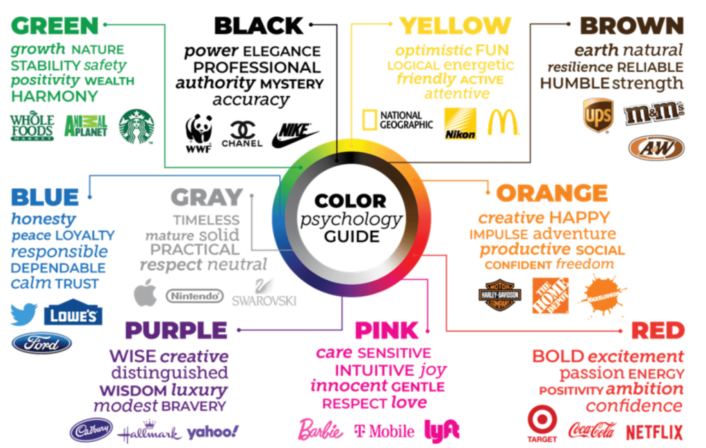
Each color conveys a unique message, and brands leverage this to create a specific impression on their customers. Below are the meanings of each color and examples of brands that use them.
1. Red: Passion, Energy, and Urgency 🔴
Red is a color that immediately grabs attention. It is associated with energy, emotion, and, in marketing, it is used to create a sense of urgency. It is also considered a color that stimulates appetite, making it common in food brands.

- Coca-Cola: Red in its logo conveys emotion, enthusiasm, and energy, while also creating a sense of familiarity with consumers.
- Netflix: Uses red to evoke urgency and excitement, encouraging users to watch content without delay.
2. Blue: Trust, Security, and Calmness 🔵
Blue is a calming color that symbolizes trust, security, and reliability. It is widely used by companies wanting to convey professionalism, such as banks and tech companies. 

- Facebook: The blue in its logo communicates trust and credibility. As it is used to connect people worldwide, trust is key to its identity.
- PayPal: The use of blue in PayPal establishes a sense of security in financial transactions, which is crucial to the brand.
3. Yellow: Optimism, Joy, and Energy 🟡
Yellow is the most visible color in the spectrum, meaning it can grab attention quickly. It is associated with happiness, optimism, and youth. Brands use it to appear friendly and approachable.
- McDonald’s: Yellow, along with red, is used to stimulate appetite and create a joyful atmosphere.
- IKEA: Uses yellow to convey optimism and fun, reflecting its accessible and affordable approach to furniture.
4. Green: Health, Nature, and Growth 🟢
Green is a color that represents nature, health, and prosperity. It is often used in brands that want to promote sustainability, health, or eco-friendly technology.

- Starbucks: The green reflects its commitment to sustainability and the freshness of its products. It also creates a relaxing and friendly environment.
- Whole Foods Market: Uses green to represent its focus on organic and natural products, appealing to health-conscious consumers.
5. Orange: Creativity, Enthusiasm, and Energy 🟠
Orange combines the energy of red with the joy of yellow, creating a sense of creativity and optimism. It is a color that invites action, so it is frequently used in calls to action and promotions.

- Fanta: Its orange color evokes fun and vitality, stimulating a sense of enjoyment when consuming the product.
- Nickelodeon: Uses orange to grab children’s attention and create a fun, friendly atmosphere.
6. Black: Sophistication, Luxury, and Power ⚫
Black is the color of elegance, luxury, and exclusivity. High-end brands use it to create a sense of prestige and sophistication.

- Chanel: Black is synonymous with luxury and exclusivity, reinforcing the brand’s premium image.
- Nike: Uses black to convey power and a strong focus on performance, while maintaining a modern and sleek appearance.
7. White: Purity, Simplicity, and Clarity ⚪
White is a color that symbolizes purity, minimalism, and cleanliness. Brands that focus on simplicity and clarity use it to project these values.

- Apple: The use of white reflects its focus on simplicity and advanced technology, giving its products a futuristic and clean feel.
- Tesla: Uses white to convey elegance and advanced technology, reinforcing the perception of luxury and design.
How to Use Colors in Your Marketing Strategy?
- Know your audience: What emotions do you want to evoke? If your target audience is young and energetic, colors like red or yellow can be effective. For a more professional audience, blue or black may be better.
- Conduct A/B tests: Don’t hesitate to experiment with different color schemes in your marketing campaigns and see which one generates the most conversions.
- Brand Consistency: Colors should be consistent across all your brand’s communication channels, from your website to social media and advertising, to build strong brand recognition.
Color psychology is a powerful tool in marketing. Using the right colors in your brand not only grabs attention but also influences consumer emotions and decisions. By understanding how colors affect perception, you can create a more engaging and effective experience for your audience.
So, the next time you think about designing a campaign or choosing your brand’s colors, remember that color is not just aesthetics: it’s strategy, and at D&S Agency, we help you implement it.